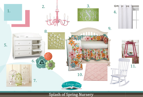
Now for the design board breakdown…
1. OH BABY!! Little girls are a blessing from above (as all little one’s are)! I absolutely adored designing this nursery for your new addition! I know we talked about creating a bright and cheerful nursery with bursts of girlish colors! I would start out by putting a fresh coat of no VOC paint on the walls in a crisp aqua color from Sherwin Williams called (6765) Spa. This is going to give you the instant splash of color you desire! As for the trim, I really suggest keeping it the bright white you already have for an extra crisp look. When it comes to the rest of the color palette we’ll be bringing in fair amounts of bright colors that will create an inviting room full of interest and personality!
2. Bringing in an adorable chandelier really creates an enchanting atmosphere in any girl’s room. In this case, I suggest taking this inexpensive light and spray painting it with no-VOC paint in a punchy pink shade. With a few even coats this ordinary chandelier will come to life and add a hint of fun to the room! See the color sample from Sherwin Williams 6577 Jairpur Pink. For a more budget friendly approach, try visiting your local thrift store or searching on craigslist for a unique chandelier you can refurbish!
3. A really fun way to really personalize your baby’s nursery is by using monograms. Instead of embroidering pillow cases and towels, try using this clever removable wall decal with your child’s initials. These decals come in a flat finish to look like paint, but are very easy to remove. You can choose your color and your letters. I suggest going with the white which will work great in your space and add to the crisp look we are striving for! Place this above the crib for a more personalized and polished look!
4. Considering we have added a lot of bright colors and pattern (in the bedding), I think furnishing your window in these soft and classic white panels will keep things fresh and breezy. Paired with white furniture, trim and accessories, these curtains will add a light and airy feeling to the room. Remember, when you use a lot of bold and graphic patterns in a room (on a sofa, rug or bedding), softening it with solid accessories and window treatments keep that “busy” look from happening!
5. Here’s the ever-so practical changing table that I suggest for the nursery! The advantage of this table is that it has extra drawers for clothes and for storing other items. I would love to see this on the opposite side of the room from the crib. With so many colors, patterns and textures being incorporated into the space, matching your furniture finishes will really help soften up the space! This one happens to come in a white, which will match perfectly with the crib you previously purchased.
6. Since the changing table itself could use some spicing up… I thought switching the knobs out for some cheerful and childlike ones is perfect! This is an inexpensive way to transform the ordinary look of the white changing table and really make it interesting! Check out these eclectic and girly green, aqua and orange knobs. Little touches like this can really make a space!
7. Once you have placed the crib on the back wall and the rocking chair to the right of it in the corner, this whimsical bird cage will look stunning hung right above the chair. Additionally, the cage will add to the garden sensation already being exhibited by the bedding and add a “story bookish” character to the room!
8. Honing in on the “spring” theme, I know these adorable wall flowers will create a joyous art piece in the nursery. I suggest dispersing them randomly starting on the left wall and moving into the corner to the right wall. Sprinkling these will add to the crisp tone to the room while also echoing the breezy character the window treatments give off!
9. It all started here! The cheerfully vibrant bedding was the inspiration behind it all! I became instantly smitten with the bold colors and fresh flowered pattern. Most baby bedding ensembles are drenched in light and soft colors, while this one is both stimulating and eye catching! Incorporating such a vibrant and graphic focal point in the room really sets the stage for the spring theme and adds personality to the room. To soften the space up a bit, soft and less deliberate items will be blended in.
10. Although bright colors and bold patterns are dispersed throughout the space, I suggest using this soft trellis rug for the middle of the room. Paired with the radiating splash of spring the bedding exudes, the rugs simplicity and softness will help achieve a sense of comfort, while streamlining the exciting spring theme. Plus, it will look amazing underneath that adorable illuminating chandelier! (Remember, you don’t have to be obvious when unifying a theme within a space. Combing dashes of animated pattern and color with soft hints that obscurely direct right back to your theme will enhance and complete your space. For example, the bedding I selected for you is very eye-catching and screams spring, while the rug compliments the theme with its obscure trellis pattern!)
11. To designate a specific area for nursing/ reading, the corner to the right of the crib is a perfect location for this classic white rocking chair. For practical purposes, I also suggest this petite side table and sweet beside lamp (in white) which complete this cute and much needed nook! As a bonus, the birdcage I mentioned earlier will be hanging right above and add instant interest and character!
Oh… and for some extra ideas and inspiration…
- For extra storage, use baskets and decorated bins! They make a space look organized while concealing necessary items!
- Accessorize with green, white and orange odd and ends (like picture frames, blankets, etc). This will really unify the space and create that girlish, bold look you are after!
- To add to the comfort of your rocking chair, try this colorful and cozy chair pad!
- Quick side note: Be sure not to add too many themed accessories… only a hint here and there! That way it doesn’t start looking too busy!
So… congratulations! Enjoy your new little one! We hope she enjoys her new space as much as you will! We can’t wait to hear your thoughts and see the outcome! Have fun and happy shopping!
Are you looking for help in designing your nursery? Look no further… we would love the opportunity to make your space enchanting! Click here for more information…


Beautiful ideas! I’m putting together a nursery right now (we are hoping to adopt a newborn), and your design has given me some wonderful inspiration. Thank you!
Erin~ I am so glad! Take some photos when you are all done and will feature you in a post! Congrats, my sister adopted as well!
Lindsay, I really like your work. I am an ID student here in ATL AIA and will graduate in a year. If you don’t mind terribly, I was wondering what program you are using for your cool Design Boards (would be nice to do something different for my class). If you want, email me direct for this (I understand). Many, many thanks! ~Edmund (i’m using my dad’s email account…FYI). Thanks!