Happy Monday!! Hope your weekend was full of fun and relaxation! I had a list of to-do’s… I just didn’t get to all of them! It just makes for a busier Monday, that’s all!
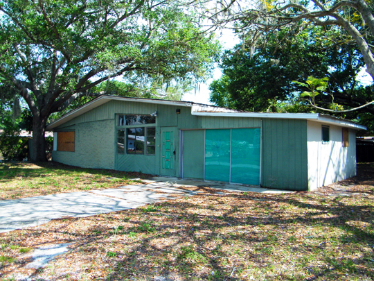
I am really excited to show you today’s post! It’s been a long time coming and I have been talking about it for like EVER. Remember the good ol’ rehab house we bought and are fixing up? We posted about it, oh… like back last April… wow! It’s been almost a year, so in case for some reason you can’t remember the ugly house… here ya go…
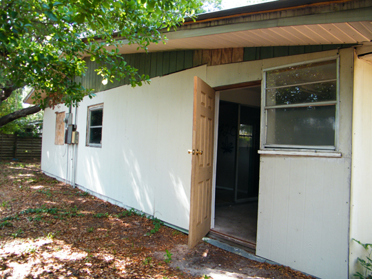
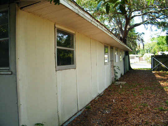
Here’s the back & side of the house…
We had a goal to start rehabbing houses last year. The plan was to bring them back to functioning & beautiful homes worthy of a family to occupy. It’s been a really long process. Like, really long. We are actually finishing up the “punch out list” as we speak, but this beauty is back on the market! (If you are interested in seeing it, please email me… I can send you the listing and the “after shots”). It has taken us a little longer than expected due to the city, unforeseen issues and just because we wanted it to be a labor of love… and IT HAS been!
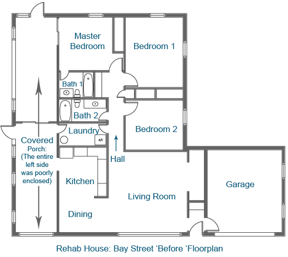
So… you haven’t even seen the “before” shots quite yet! As promised… these are worst than the outside of the home… if that is even possible! Before I show you the before pics… let me show you the “before” floor plan so you can get your bearings! (Btw, the floor plan has changed quite a bit since).
So let’s go room by room… (These are “overall” room shots.. we will get into detail as the blog posts go)
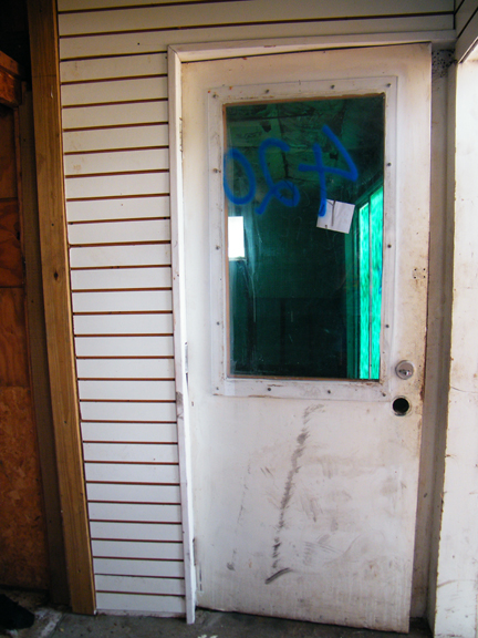
Entryway: The entry was really weird. You entered the front door and had a choice to go left into the house, or right into the garage. Straight ahead there was a closet… Here’s the door into the garage…
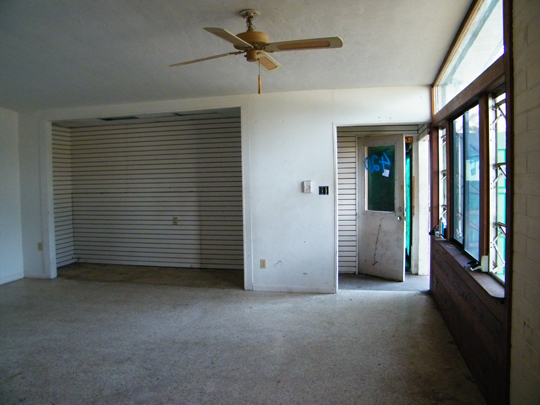
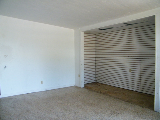
Living Room: The living room also was bit weird in shape. It had terazzo floors, which were in super bad shape, slat-wall paneling on a few of the walls (weird) and graffiti. Nice, right?!
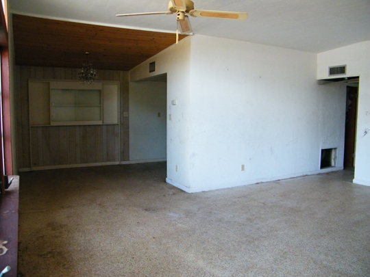
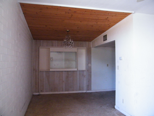
Dining Nook: The dining area had a beautiful ceiling actually. The wood was in great shape, well installed and is staying! The chandelier… well that went to Habitat! The wall with the paneling will be gone with renovations! Woo hoo!
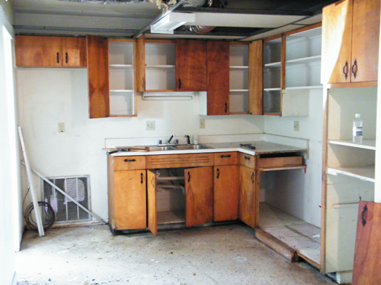
Kitchen: EVERYTHING MUST GO. And everything did. EVERYTHING.
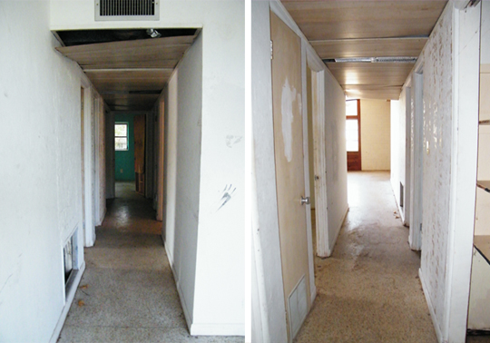
Hall: (Left) this is heading towards the back of the house & (right) this one is heading to the front! Everything was stripped here too.. the ceiling especially!
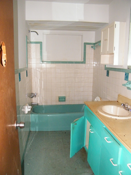
Bath 2: This space needs a major gut! What more is there to say, really?!!!
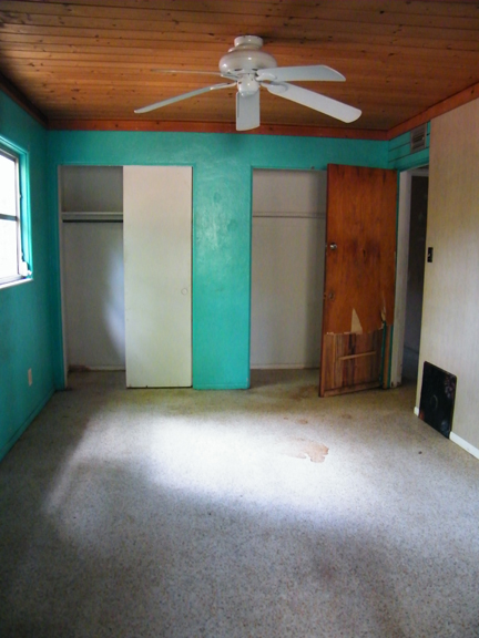
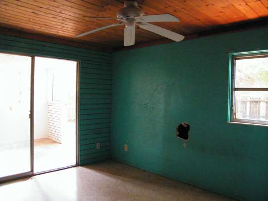
Master Bedroom: The master bedroom has the same wood ceiling as the dining nook.. it’s staying! The slat walls, sliding glass doors, the door, the paint color (obviously) & the floors are all ‘going’! Oh… and it’s no longer going to be the master, so the door to bath 1 will also be going!
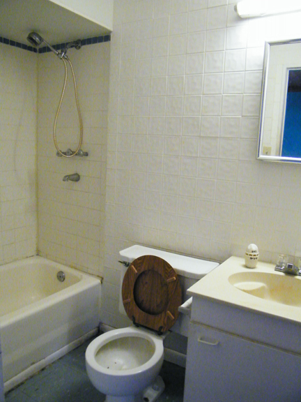
Bath 1: This was officially the ‘master bathroom’. I didn’t see anything worth saving… it’s all going. In fact, it’s going to expand and not longer be part of this room!
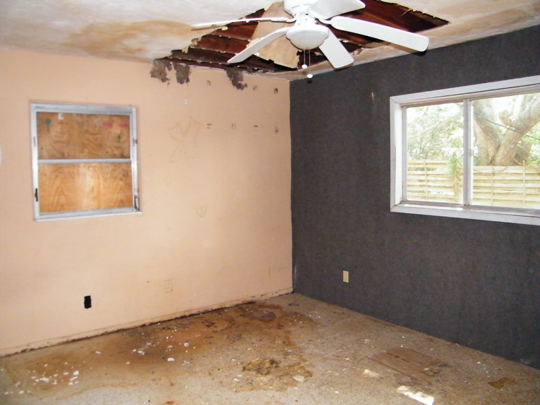
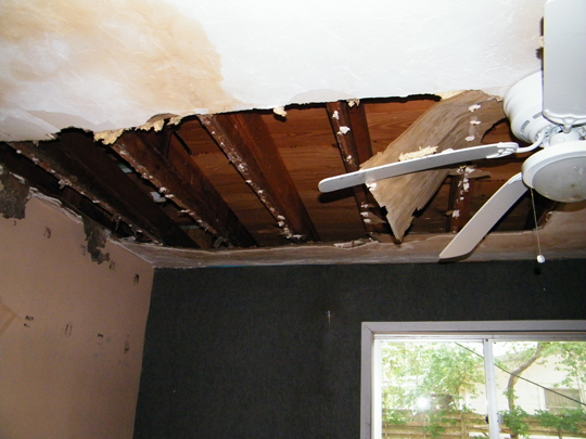
Bedroom 1: This is the aforementioned room with carpet on the walls! No lie.. see the gray wall? Yep… it’s commercial grade carpet. Doesn’t it make you want to slap some of that on your walls too? No.. Oh! The ceiling had a major leak, the window was boarded, the floor… well it’s disgusting! Everything goes!
Here’s a quick close up… we tore the wet drywall down (or what was left of it) to see what exactly was happening….
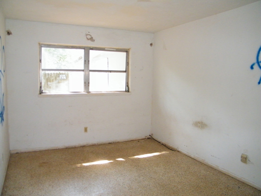
Bedroom 2: This might be the best ‘looking’ room in the house! It’s pretty standard as far as secondary bedrooms go!
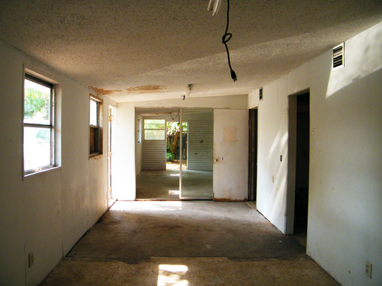
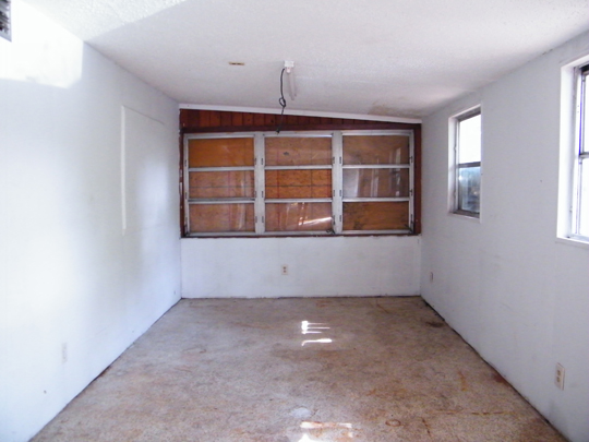
Now… the entire left side of the house used to be a covered porch (we believe)… someone, sometime, somehow converted into extra space for the house “under air”. Too bad it didn’t make sense and it really was is bad shape. It featured graffiti, slat paneling, sliding glass doors & so much more!! The entire thing had to be stripped & re-done.. ceilings, lighting, air, drywall, walls, doors, windows, floors… crazy! This entire side of the house now adds so much usable space… just wait until you see it!
We really re-worked the floor plan, stripped EVERYTHING and started on a great design plan. Just wait until you see… it’s going to blow your mind! Like I am promise! Stay tuned… you won’t wanna miss a thing!
Every week we are going to be showcasing a ‘piece’ of the rehab house in the making! Now that we have shown you most of the before’s, we can really get in and show you our entire process. I hope you’ll stay tuned.
P.S. We were nominated on Apartment Therapy’s blog to win a Homie award. It’s basically like the Oscars of blogland. I really hope you will go & vote for A Design Story! We would love to win!

I am so excited to see the after shots!
Thanks Katie!! I really appreciate it. When I was adding the before shots to the blog, I was amazed on how far we have come!
Oh my!! I forgot it looked that bad! haha…It came a really Long way…Labor of Love for sure! Can’t wait to see all the new pic……I have seen it in person and I can say WOW!!!
Wow! I can’t wait to see the after shots. I’m sure it looks like a completely different house.
So awesome! Can’t wait to see the progress! My hubby and I are hoping to one day be able to start flipping!