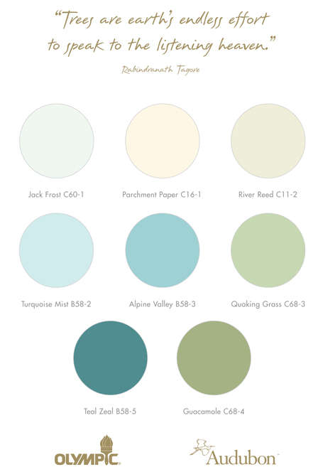
This weekend, Kevin and I spent a little time at Lowe’s browsing their paint collections. Usually I am a strict Benjamin Moore & Sherwin Williams’s kind of gal {thanks to many years of good experience with both}, but I think I have found my perfect color combos with Olympic Paints new Audubon Collection.
Everyone knows I am an aqua lover… yep… Completely obsessed with aqua, deep turquoise and all the shades in between. Finding the perfect shade of aqua paint is a bit tricky, it can be compared to finding the perfect shade of grey for your walls… there is the perfect middle, it just takes some time to find it. Some aqua hues can be a bit too blue or too green… neither of which will do. My perfect shade of aqua has finally been found. Or should I say perfect shades.
Pretty, right?
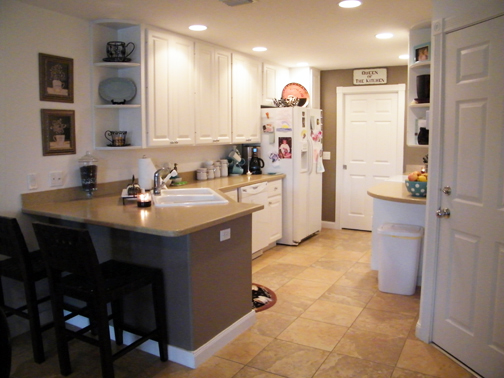
A few months ago, we painted our kitchen a rich brown-taupe color. I mentioned to you then that I wasn’t sold it on. We have “sat” on it for awhile now. Kevin doesn’t mind it {I think because he doesn’t want to re-paint it} and I am still not in love with it. As an interior designer, I “play” more with my own house and take risks that I know may not work out… it is all about learning and growing… plus, it is all about mixing two styles into one.
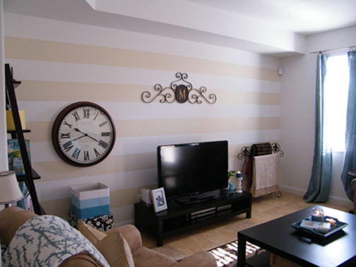
Anyways, I don’t love it and I want to. I spend a ton of time in the kitchen and I want it to feel the way the rest of my home does. I guess I fell so deep in love with our striped living room wall, that I feel the need to “love” every bit of my home {and should} just as much. So, yep… we are young, in love and we are going to paint it again!
Here’s the striped wall right after we painted it…
and here’s the kitchen right after we re-painted it…
Blah or what?
Now for some color options…
{P.S. These colors are different in person} You can view the entire Grandeur Collection on Olympic’s Website.
The Concept: Beachy, Airy, Fresh and Crisp. Since our kitchen, living and dining rooms are all open to one another {you can see it in the floor plan}, it is important that they all have a flow and unite with a common theme. The living room wall is tan and white striped and adding a soft, breezy aqua to the kitchen will really enhance the downstairs all together.
I am excited to get started and I can’t wait to show you!
What do you think? Ever painted a room and waited for a few months to see if you could grow to like it? Come on… spill it and don’t spare the details.
______________________________________________________________________
P.S. We are still deciding the new color for the Master Bedroom… find out those details here.
Also, I spent some time this past week and weekend Spring Cleaning and before I unload some new tips… I thought if you are in the mood to get started early {like me}, you can read up on last year’s tips!


Love the light aqua color… I think it will look great. I am looking forward to seeing it all finished!
Thanks Sarah… I can’t wait to ditch that brown color and get back to a look that is more “us”…
Oh love the aqua mist colour you picked – or maybe i am just obsessed with all aqua colours (even worked it into my blog theme colour! ha ha)…
meagan
the row house nest
http://www.rowhousenest.com
So did you reprint your kitchen? How did it turn out?