SO, COVER UP!
This is the last part to our mini window treatment series! Did you see the first posts? Well click here… part 1, part 2 & part 3.
Making color work…
Color is the most emotional and significant element of a window treatment and the importance of selecting appropriately cannot be overstated. Here are some suggestions and considerations for making wise color choices!
- Select colors that are desirable in a large quantity.
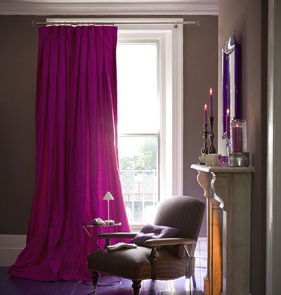
- Colored fabric influences the light that enters the room. Remember that even transparent sheers will “color” the light entering the room and use necessary caution. The slightest cast can profoundly affect color and may distort the way color is perceived in the rest of the furnishings.
- Color should be personal where appropriate, but pleasing to all who enter the interior. Color has great power to create a mood and to influence the emotional and psychological response to the entire interior. (Want to learn more? Click here).
- Be wary of color at the window that is unusual or intense and visible from the exterior. Many treatments can be either lined or will have white as a standard or option on the back of the treatment. White is a standard, accepted color for exteriors. “Colors” viewed from the exterior are often believed to be in poor taste.
- Remember color can date quickly when it is bright or visually demanding. “Fashion” colors- that is, those of the color trend cycle- can be used, certainly, but remember the “brights” evolve fastest and the palette is different every year!
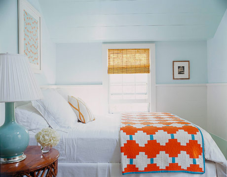
- Consider neutrals. Contemplate using white or off white for “classic” alternative treatments (blinds, shutters etc). Then utilize color “around” the window in valances, or side-panel draperies where the color will not be exposed to the view or damaging sunlight and where it can be changed with the fashions.
Pattern at the window…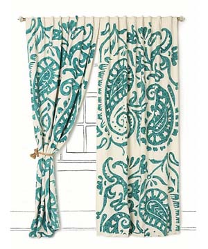
- Pattern, like color, can be surprisingly intense and engulfing to the viewer in large quantities. Take into consideration the effect it will have on the room and the occupants. This can be judged according to the quantity of pattern used in combination with its color.
- Pattern motifs should be conducive to the theme of the room. Every pattern has its roots in a historic period, which is a key factor in appropriately coordinating window treatment fabrics with furniture and accessories. Often this factor is overlooked in favor of finding just the right color. However, pattern should be on equal footing with color in making a well-rounded selection!
- Be sensitive to the scale of the pattern motifs. Balance should prevail. Generally, larger scale patterns are best in large interiors, and smaller patterns in smaller interiors or settings. These rules can be broken or reversed for dramatic effect, such as using a large- scale pattern on a small application. This, however, is the exception, not the rule.
- Combining fabric also takes some skill. A good rule of thumb concerning pattern is to use just one large pattern, one small pattern- such as a tiny “filler fabric”- a stripe (subtle or clear) and a few appropriately textured solid fabrics.
- Patterns, like color, can evoke powerful psychological responses from the viewer or occupant.
Texture…
- Texture can replace pattern and can have a greater level of sophistication.
- Texture is less demanding than color. Use texture in neutrals for interiors where seriousness or concentration (or even stress-reduction) is important.
So… that’s our take on Cover Up! Do you need help covering up your windows? Do tell… we would love to help!
Images couresty of Anthropologie, House Beautiful & My Home Ideas .
Leave a Reply