Psychology of Color
I am a big believer in the transformative power of color. Color creates paramount psychological (mind) and physiological (physical) effects. Many color studies have been performed and the findings are quite intriguing! As a designer, I was taught that the effects of color are immensely valuable to understand when planning a space. To grasp the psychology of color, let me show you each color and their effects.For example, responding to the notion that red will excite one to action while blue will calm one’s nerves is crucial in certain settings. Athletic directors have been known to paint their own locker rooms red or orange and the visitors in soft blue shades.
Here are a few color study facts I couldn’t resist mentioning: (I agree with some… and some I found very interesting to say the least!)
- Workers more efficiently in surroundings painted in pleasant colors than they do drab environments
- Medical offices painted in soft, calming colors, as opposed to stark white, make patients feel more comfortable and relaxed. Colors really can improve the rate of recovery of sick patients
- Fast-food restaurants tend to use bright warm colors for the interiors in order to stimulate the appetite and hurry customers through their meals
- The entrance hall or reception area introduces and sets the tone for the space
- Living areas and conference rooms used for formal purposes generally have neutralized color schemes that tend to produce tranquility
- Dining areas are at their best when their color schemes are modest
- Informal Living Areas such as family rooms or recreational rooms are often treated in stimulating color schemes that create a cheerful and casual atmosphere.
- Bedrooms and private areas should be based on your personality. As a general rule, the master bedroom should be designed in restful, pleasing tones. Nurseries and children’s rooms can also be based on personality. (My own note: make sure you select colors that evoke a calming environment that encourages development and learning!)
- Private offices are much like bedrooms, base the decor on your personality. Choose comfortable and inviting colors since you may be in the space for extended periods. (My own note: make sure to select a color that invigorates productivity and is easy on the eyes!)
- Color schemes for bathrooms usually reflect the adjoining rooms. Warm colors enhance the skin tones and white reflects cleanliness.
Here is a mind blowing rundown of each color, what effects they may cause and tips on how to apply them in a space effectively!
White- (Neutral Color)
Psychological & physiological associations: purity, freshness, cleanliness, sophistication and sterility.
Application:
- a pure and jubilant color
- exemplifies cleanliness and sophistication
- assists in clear thinking and encourages clarity
- if used alone, it can give off a mood of sterility and emptiness
- has a way of making all colors in a room look cleaner and livelier
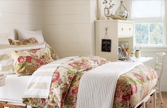
Black- (Neutral Color)
Psychological & physiological associations: sorrow, depression, sophistication, mystery and magical.
Application:
- a conformable color (very compliant)
- when used in large areas can be very dramatic
- makes a room appear smaller for a cozy, stabilizing feeling
- increases the ability to focus and gain a sense of self
- In furniture finishes, accessories and small areas of fabric add an important accent that makes other colors look clear and crisp
Brown- (Neutralized Color)
Psychological & physiological associations: earth, wood, warmth, comfort, security, support and stability.
Application:
- make excellent and supportive backgrounds
- gives off a sense of deep connection to the earth
- makes a room feel natural and brings the outside in
- is believed to afford a sense of stability and wholeness
- the homeyness of brown tones makes them universal favorites
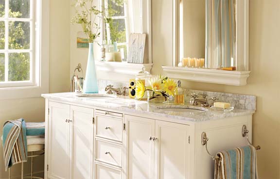
Pink- (Warn Group- Secondary Color)
Psychological & physiological associations: love, romance, youthfulness, soft and emotional.
Application:
- sweet and angelic
- is thought to have a calming effect
- pink symbolizes youthfulness and softness
- it’s often associated with love, romance and kindness
Purple/ Violet- (Cool Group- Secondary Color)
Psychological & physiological associations: royalty, nobility, power, drama, dignity and mystery.
Application:
- a rich electrifying color
- provides a sense of drama
- evokes a feeling of strength
- combines well with both pink a blue
- inspires creativity and artistic talents
- is associated with spirituality and wisdom
- provides a soothing effect on the ears, eyes, and nervous system
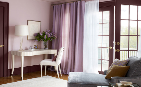
Blue- (Cool Group- Primary Color)
Psychological & physiological associations: honesty, truth, loyalty, masculinity, formality, tranquility, sobriety, sky, depth of sea.
Application:
- cool, soothing, reassuring, and calming
- decreases heart rate and body temperature
- in known to aid in productivity in an office environment
- perceived as a constant in our lives since it’s the color of the ocean and the sky
- can be somber, cold and even depressing if not used effectively
- it is affected by the different materials it colors more than any other color
- may encourage individuals to be honest, committed , dependable and trustworthy
- is used to help babies with respiratory distress syndrome (good color for medical space)
- Least appetizing (some weight loss recommendations even suggest eating off of a blue plate)
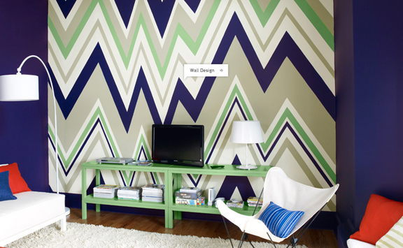
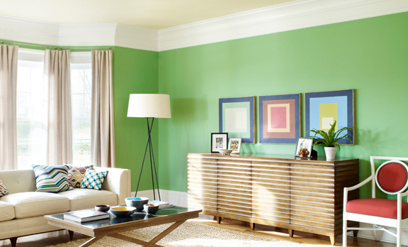
Green- (Cool Group- Secondary Color)
Psychological & physiological associations: nature, serenity, hope, envy, safety, peace, passivity, and security.
Application:
- creates a deep feeling of security
- particularly pleasing in food areas
- fresh and friendly- “nature’s color”
- represents peacefulness, comfort and tranquility
- aids in easing depression, nervousness, and anxiety
- a good mixer- especially yellow-green or dark green
- can improve your reading ability (easiest color on the eyes)
- green is thought to relieve stress and help heal (Those who have a green work environment experience fewer stomachaches)
Yellow- (Warm Group- Primary Color)
Psychological & physiological associations: sunlight, optimism, warmth, enlightenment and communication.
Application:
- brings life to a room
- stimulates mental activity and memory
- believed to encourage communication
- reflective and take on tones of other colors
- stimulates optimism, creativity and expression
- said to strengthen muscles and your mental state
- the most visible color and the most fatiguing to the eye
- a few studies suggested the babies tend to cry more in yellow rooms
- other studies also indentified that couples argue most in yellow kitchens
- can assist in concentration, memorization, visualization skills, speaking, and writing
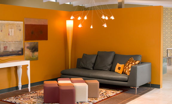
Orange- (Warm Group- Secondary Color)
Psychological & physiological associations: cheerfulness, stimulation, sunset, excitement.
Application:
- energetic, delightful and refreshing
- lighter tones enhance human skin tones
- like red, it has stimulating properties but not as demanding
- calls to mind feelings of excitement, enthusiasm, and warmth
- takes creativity and enthusiasm to new levels
- stimulates the lungs, respiration, and digestion
- been known to heighten one’s IQ as much as twelve points
Red- (Warm Group- Primary Color)
Psychological & physiological associations: courage, passion, love, excitement, danger, martyrdom, anger, fire and strength.
Application:
- stimulating and lively
- evokes a sense of deep courage
- conspicuous wherever it appears; and thus recommended as an accent color
- mixes well and most rooms are enhanced by a touch of it
- may damage a person’s ability to settle down or concentrate for extended periods
- affiliated with energizing organs, blood circulation, and the senses of hearing, smell, taste, vision and touch
So what are your thoughts on the psychology of color? Does it have you rethinking any color selections you’ve made in your own home or office? Having knowledge of these consequences to color have really helped me in my design experiences to utilize the right color for the right space! I designed my home around soft aquas and browns, both giving us a bit of nature and serenity! After looking back at this, as a newlywed I find it funny I selected a shade of blue because it evokes a sense of commitment and dependability! Funny how subconsciously we chose colors based on our personality and morals! Talks to me… tell me what you think or have experienced.
All inspiration images courtesy of Benjamin Moore. Information provided by Beginnings of Interior Environments
Leave a Reply