It’s time for another Rehab House update! I nailed down the design plan and we stuck to it…
In case you haven’t seen the previous posts on our lil’ rehab adventure… here they are in order:
Now that you have seen what we started with and the way we changed the floor plan for a better layout, I want to show you the design direction I felt was best for the house. When we decided to start rehabbing houses again (Kevin and I rehabbed one when we were dating), we wanted a house we could feature a very retro design plan in. That was the original plan for this house… except… the more I looked at it, I saw a cool + coastal design. The house was begging for a crisp white + light feel… it told me so 😉
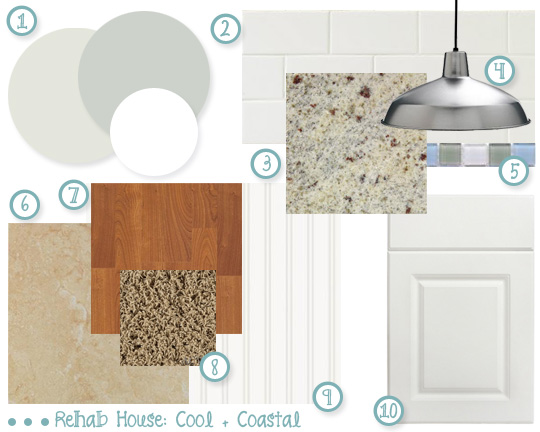
So, we nixed the retro look and went for it… my hubby is good like that… I follow him in our marriage and he follows me in design. It just works. So this is the mood board I came up with to prove my point…
To showcase the design plan, everything I selected worked within our budget, it had too. The goal was to take this disgusting knock-down of a house and create a home worth living in, except it was for someone else. When you are buying a house to rehab, you have to make the numbers make sense, so for budget purposes, you don’t specify the most luxurious materials for the project. You take the rooms that buyers tend to “focus on” (kitchen + bathrooms) and make those your priority areas.
Here’s the breakdown… (links & details will be given in a room-by- room source list soon)
1. Paint colors were an important element to achieve the overall “coastal” vibe we were striving for. One of my go to colors for all things coastal is Sherwin Williams Sea Salt (6024). It’s a nice mix between a light green and aqua… it’s beautiful. (I color matched it because True Value offered paint “on them” for the project… more on that later). I decided to go with Sea Salt for all of the main areas (entry, living, dining, kitchen, open office, hallway, bathrooms & laundry) and then we went for a lighter shade for the bedrooms… we just went up on the paint chip one and used Sherwin Williams Spare White (6203). As far as the trim, moldings etc… we went with high gloss bright white.
2. Subway tile was a must for me… A non-negotiable. I wanted to use this for the kitchen back-splash… It’s trendy, versatile, inexpensive and timeless.
3. Granite was a must for Kevin. He’s the realtor and although I like granite for us, I wasn’t sold on using it purely for the rehab just for budget issues. He convinced me. One of my favorite go-to granite pics is Kashmir White. It’s beautiful and luxurious. It also doesn’t have a ton of movement in it, which was great for this project because I was looking for a crisp look. As far as edges go, I am a flat polished kinda gal…
4. I am going to go room by room towards the end and show you a breakdown of where we got each thing (cabinets, faucets, carpet, lighting.. EVERYTHING), but the very first light I found was the dining pendant. I went for a stainless industrial pendant to pull off the modern + coastal look. It hangs from the wood stained ceiling and site beside the bright white brick wall… it’s gorgeous… wait until you see it!
5. I wanted to add a little more interest in the kitchen’s back-splash, after all, a great kitchen is a must on most buyers wish lists. In conjunction with the white subway tile, I convinced the hubby that a little touch of glass tile would bring a modern element to the kitchen. (I won there…)
6. Tile is a must in Florida, it always has been. I selected a neutral porcelain 16X16 tile for the kitchen, dining, open office, laundry and hall bath. (The master bathroom also had porcelain, but it was a bit more “special”.. details on that soon!). Ceramic is a less expensive choice, but it’s notorious for chipping; porcelain is a full-body tile (the color + pattern are through the entire thickness of the tile), making it impervious and great for durability.
7. I really wanted to use wood flooring in the living room and hallway to create the perfect coastal cottage look, so I picked out a medium stained laminate that was budget friendly, came with a 10 year residential warranty and looked great.
8. I am not a huge fan of carpet, in fact, I am making a public vow to never ever have carpet in another house again. But that’s beside the point, for budget & buyer purposes Kevin felt it was best to specify carpet for the bedrooms. I picked out a tan + brown frieze (low-pile shag) because the two-toned “pepper” look is great for hiding soil-age and the shag is great for durability… it wears really good.
9. What’s a coastal home without bead board? I selected a nice crisp white bead board for the entry way to spruce the space up a bit and create some character. In the bathrooms, we created our own board & batten look (more on that later). Bead board sheets are inexpensive overall, but when you use the right molding to dress it up, it looks like a pricey touch!
10. Originally, my hubby wanted dark stained cabinets, but when we nixed the retro look, the dark cabinets followed suit. I have clients tell me all the time they want a “clean, crisp & bright kitchen”… the best way to make that happen is by using white cabinets. I selected standard (in-stock) cabinets that I could dress up with stainless hardware and the subway & glass back-splash. (Remember.. details & links will be given space by space).
So there’s the original design plan. It didn’t change much, but we added a ton of great elements to it to create the PERFECT cool + coastal rehab home. It’s adorable to us and it must have been to the new buyer. We close on this beauty tomorrow… so we will say goodbye to our rehab house #1 (although technically it’s number 2 because we did one when we were dating, but since it was pre-blog, I won’t count it!) We are both excited for the neighborhood (because that house was a total eye sore just a year ago) and the new owners! Yay! Oh, and even though it won’t be “ours” tomorrow, I am still going to show you every step of the rehab…
p.s. we have two ridiculously fabulous giveaways going on right now… stop by and enter the Target giveaway & the ViVo Boutique giveaway… don’t miss them!
Have you rehabbed a house lately? Want to try your hand at a fixer-upper? What do you think of the design plan? DO TELL… we LOVE hearing your stories…


I love the plan you have! I think it’s going to look amazing!!
I love the mood board and think it will look great!